1994
1996
1998
2000
2002
2004
2006
2008
2010
2012
20%
30%
40%
50%
60%
70%
http://cepr.net
Source: Bureau of Labor Statistics, labor force statistics from the current population survey.
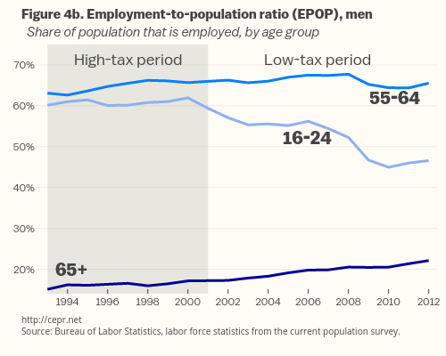
Figure 4b. Employment-to-population ratio (EPOP), men
Share of population that is employed, by age group
High-tax period
Low-tax period
55-64
65+
16-24
plotly-logomark
Edit chart
Bdew's interactive graph and data of "Shaded region, 55-64_Men, 65-over_Men, 16-24 Men" is a filled line chart, showing Shaded region, 55-64_Men, 65-over_Men, 16-24 Men. The x-axis shows values from 1992-06-01 to 2012-06-01. The y-axis shows values from 14 to 75. This visualization has the following annotations: http://cepr.netSource: Bureau of Labor Statistics, labor force statistics from the current population survey. ; Figure 4b. Employment-to-population ratio (EPOP), men Share of population that is employed, by age group; High-tax period; Low-tax period; 55-64; 65+; 16-24