Edit chart
Loading graph
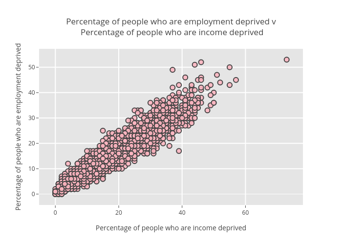
Billatnapier's interactive graph and data of "Percentage of people who are employment deprived v Percentage of people who are income deprived" is a scatter chart; with Percentage of people who are income deprived in the x-axis and Percentage of people who are employment deprived in the y-axis.. The x-axis shows values from 0 to 0. The y-axis shows values from 0 to 0.