Edit chart
Loading graph
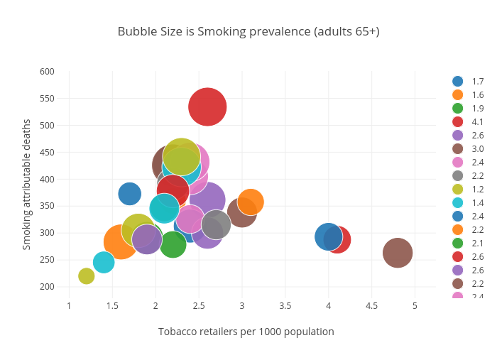
Billatnapier's interactive graph and data of "Bubble Size is Smoking prevalence (adults 65+)" is a scatter chart, showing 1.7, 1.6, 1.9, 4.1, 2.6, 3.0, 2.4, 2.2, 1.2, 1.4, 2.4, 2.2, 2.1, 2.6, 2.6, 2.2, 2.4, 2.2, 1.8, 2.3, 4.0, 3.1, 2.2, 2.2, 1.9, 4.8, 2.4, 2.7, 2.3, 2.1; with Tobacco retailers per 1000 population in the x-axis and Smoking attributable deaths in the y-axis.. The x-axis shows values from 0 to 0. The y-axis shows values from 0 to 0.