Edit chart
Loading graph
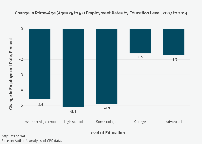
Cashmank's interactive graph and data of "Change in Prime-Age (Ages 25 to 54) Employment Rates by Education Level, 2007 to 2014" is a bar chart, showing Change, 2007 to 2014; with Level of Education in the x-axis and Change in Employment Rate, Percent in the y-axis.. The x-axis shows values from -0.5 to 4.5. The y-axis shows values from -5.9 to 0. This visualization has the following annotations: http://cepr.netSource: Author's analysis of CPS data.; -4.6; -1.7; -1.6; -4.9; -5.1