Edit chart
Loading graph
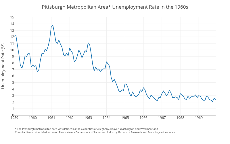
Cbriem's interactive graph and data of "Pittsburgh Metropolitan Area* Unemployment Rate in the 1960s" is a line chart; with Unemployment Rate (%) in the y-axis. The x-axis shows values from 0 to 0. The y-axis shows values from 0 to 15. This visualization has the following annotation: * The Pittsburgh metropolitan area was defined as the 4 counties of Allegheny, Beaver, Washington and WestmorelandCompiled from Labor Market Letter, Pennsylvania Department of Labor and Industry. Bureau of Research and Statistics,various years