Edit chart
Loading graph
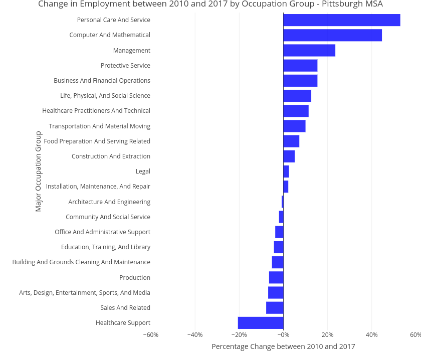
Cbriem's interactive graph and data of "Change in Employment between 2010 and 2017 by Occupation Group - Pittsburgh MSA" is a bar chart, showing Multiple Periods; with Percentage Change between 2010 and 2017 in the x-axis and Major Occupation Group in the y-axis.. The x-axis shows values from -0.6 to 0.6. The y-axis shows values from 0 to 0. This visualization has the following annotation: note1