Edit chart
Loading graph
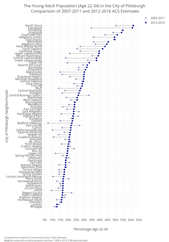
Cbriem's interactive graph and data of "The Young Adult Population (Age 22-34) in the City of Pittsburgh Comparision of 2007-2011 and 2012-2016 ACS Estimates" is a line chart, showing 2007-2011 vs 2012-2016; with Percentage Age 22-34 in the x-axis and City of Pittsburgh Neighborhoods in the y-axis.. The x-axis shows values from 0 to 0. The y-axis shows values from 0 to 0. This visualization has the following annotation: Compiled from American Community Survey 5-Year EstimatesNeighborhoods with a total population less than 1,000 in 2012-2106 data excluded