Edit chart
Loading graph
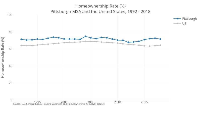
Cbriem's interactive graph and data of "Homeownership Rate (%)Pittsburgh MSA and the United States, 1992 - 2018" is a line chart, showing Pittsburgh vs US; with Homeownership Rate (%) in the y-axis. The x-axis shows values from 0 to 0. The y-axis shows values from 0 to 100. This visualization has the following annotation: Source: U.S. Census Bureau Housing Vacancies and Homeownership (CPS/HVS) dataset