Edit chart
Loading graph
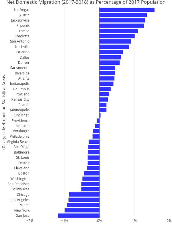
Cbriem's interactive graph and data of "Net Domestic Migration (2017-2018) as Percentage of 2017 Population" is a bar chart, showing No Name; with 40 Largest Metropolitan Statistical Areas in the y-axis. The x-axis shows values from -0.02 to 0.02. The y-axis shows values from 0 to 0. This visualization has the following annotation: note1