Edit chart
Loading graph
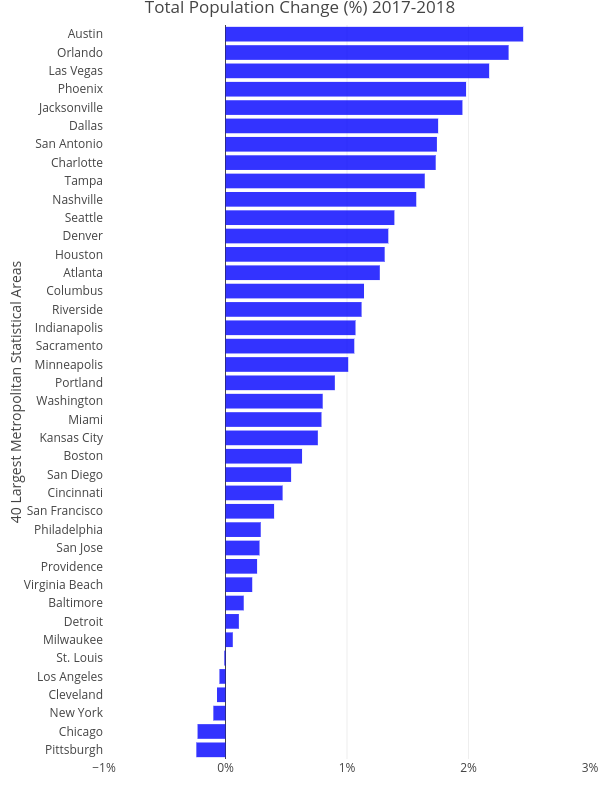
Cbriem's interactive graph and data of "Total Population Change (%) 2017-2018" is a bar chart, showing No Name; with 40 Largest Metropolitan Statistical Areas in the y-axis. The x-axis shows values from -0.01 to 0.03. The y-axis shows values from 0 to 0. This visualization has the following annotation: Compiled from Census Bureau Population Estimates Program data