Edit chart
Loading graph
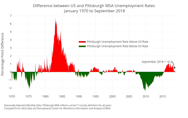
Cbriem's interactive graph and data of "Difference between US and Pittsburgh MSA Unemployment Rates January 1970 to September 2018" is a filled line chart, showing Pittsburgh Unemployment Rate Above US Rate vs Pittsburgh Unemployment Rate Below US Rate; with Percentage Point Difference in the y-axis. The x-axis shows values from 0 to 0. The y-axis shows values from 0 to 0. This visualization has the following annotations: Seasonally Adjusted Monthly Data. Pittsburgh MSA reflects current 7-county definition for all yearsCompiled from LAUS data via Pennsylvania Center for Workforce Information and Analysis (CWIA); September 2018 = +0.4