Edit chart
Loading graph
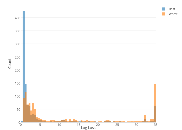
Collierab's interactive graph and data of "Count vs Log Loss" is a histogram, showing Best vs Worst; with Log Loss in the x-axis and Count in the y-axis.. The x-axis shows values from 0 to 0. The y-axis shows values from 0 to 0.