2
3
4
5
6
7
8
9
1000
2
3
4
5
6
7
8
9
10k
2
3
4
5
6
7
8
9
100k
30
40
50
60
70
80
1952
1982
2007
GDP per Capita
Life Expectancy
plotly-logomark
Edit chart
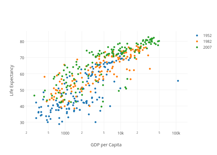
Cufflinks's interactive graph and data of "Life Expectancy vs GDP per Capita" is a scatter chart, showing 1952, 1982, 2007; with GDP per Capita in the x-axis and Life Expectancy in the y-axis.. The x-axis shows values from 0 to 0. The y-axis shows values from 0 to 0.