Edit chart
Loading graph
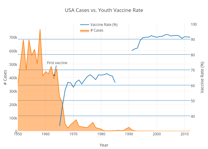
Damienrj's interactive graph and data of "USA Cases vs. Youth Vaccine Rate" is a line chart, showing Vaccine Rate (%) vs # Cases; with Year in the x-axis and # Cases in the y-axis.. The x-axis shows values from 1950 to 2012. The y-axis shows values from 0 to 798573.7894736842. This visualization has the following annotation: First vaccine