Edit chart
Loading graph
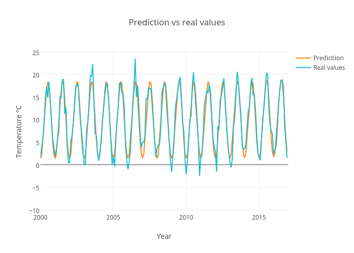
Datathings's interactive graph and data of "Prediction vs real values" is a line chart, showing Predictiion vs Real values; with Year in the x-axis and Temperature °C in the y-axis.. The x-axis shows values from 2000 to 2017. The y-axis shows values from -10.594444444444447 to 25.294444444444444.