Edit chart
Loading graph
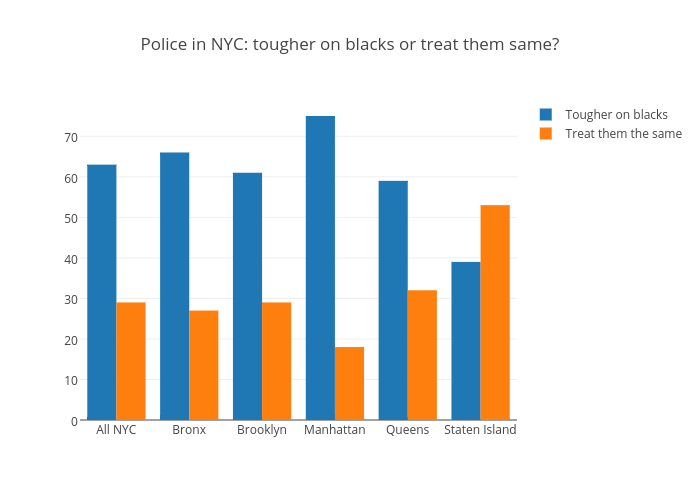
Davidljarman's interactive graph and data of "Police in NYC: tougher on blacks or treat them same?" is a bar chart, showing Tougher on blacks vs Treat them the same. The x-axis shows values from -0.5 to 5.5. The y-axis shows values from 0 to 78.94736842105263.