Edit chart
Loading graph
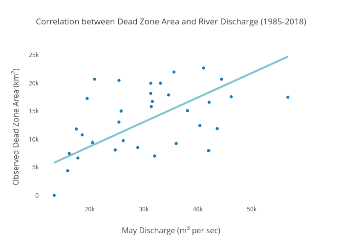
Dlmalm's interactive graph and data of "Correlation between Dead Zone Area and River Discharge (1985-2018)" is a scatter chart, showing Dead Zone Area (km2) vs Dead Zone Area (km2); with May Discharge (m3 per sec) in the x-axis and Observed Dead Zone Area (km2) in the y-axis.. The x-axis shows values from 10848.085503366594 to 59251.914496633406. The y-axis shows values from -1645.0656213728678 to 26136.81253896668.