Edit chart
Loading graph
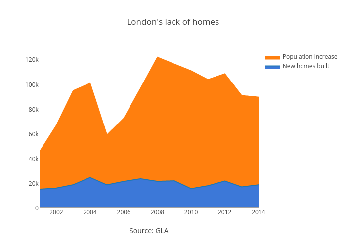
Dpyper's interactive graph and data of "London's lack of homes" is a filled line chart, showing New homes built vs Population increase; with Source: GLA in the x-axis. The x-axis shows values from 2001 to 2014. The y-axis shows values from 0 to 127744.21052631579.