Edit chart
Loading graph
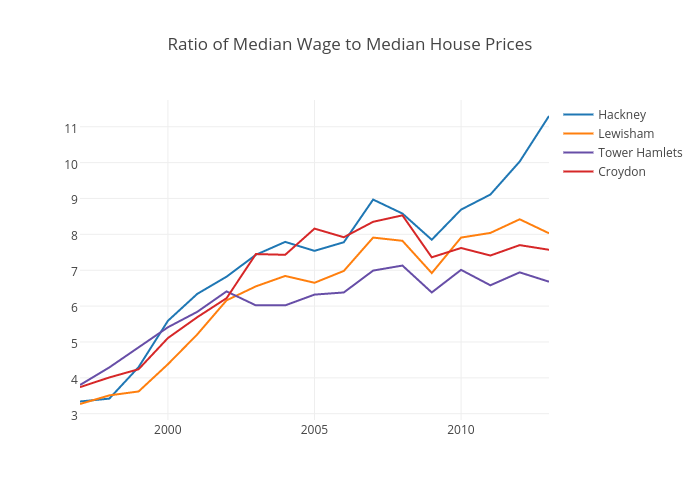
Dpyper's interactive graph and data of "Ratio of Median Wage to Median House Prices" is a line chart, showing Hackney, Lewisham, Tower Hamlets, Croydon. The x-axis shows values from 1997 to 2013. The y-axis shows values from 2.823888888888889 to 11.746111111111112.