Edit chart
Loading graph
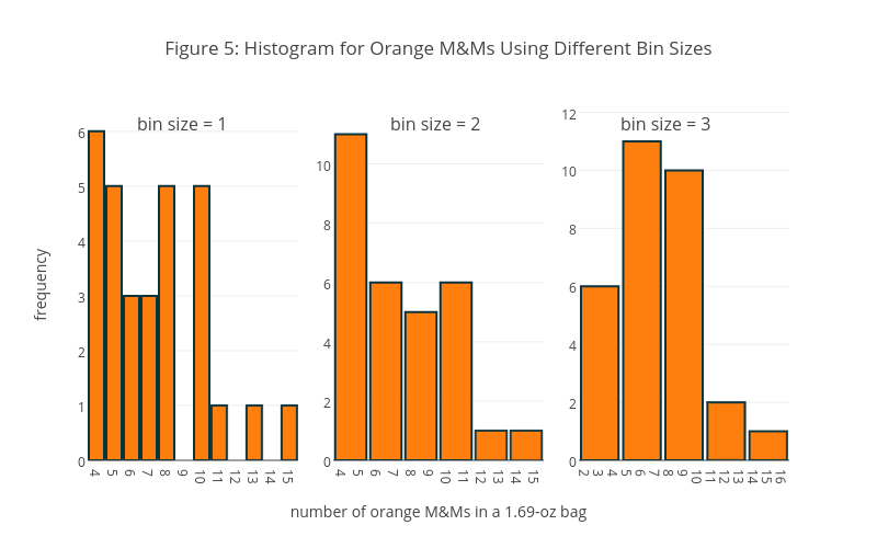
Dtharvey's interactive graph and data of "Figure 5: Histogram for Orange M&Ms Using Different Bin Sizes" is a histogram, showing orange, orange, orange; with frequency in the y-axis. The x-axis shows values from 3.5 to 15.5. The y-axis shows values from 0 to 6.3955534301208194. This visualization has the following annotations: bin size = 1; bin size = 3; bin size = 2