Edit chart
Loading graph
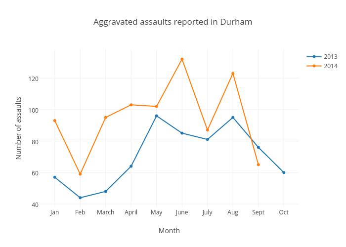
Dukechronicle's interactive graph and data of "Aggravated assaults reported in Durham " is a scatter chart, showing 2013 vs 2014; with Month in the x-axis and Number of assaults in the y-axis.. The x-axis shows values from -0.5535102739726028 to 9.553510273972602. The y-axis shows values from 37.79547900968784 to 138.20452099031218.