Edit chart
Loading graph
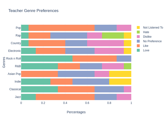
Ealcala's interactive graph and data of "Teacher Genre Preferences" is a stacked bar chart, showing Love , %{meta.columnNames.x}, %{meta.columnNames.x}, %{meta.columnNames.x}, %{meta.columnNames.x}, Not Listened To ; with Percentages in the x-axis and Genres in the y-axis.. The x-axis shows values from 0 to 1. The y-axis shows values from -0.5 to 9.5.