Edit chart
Loading graph
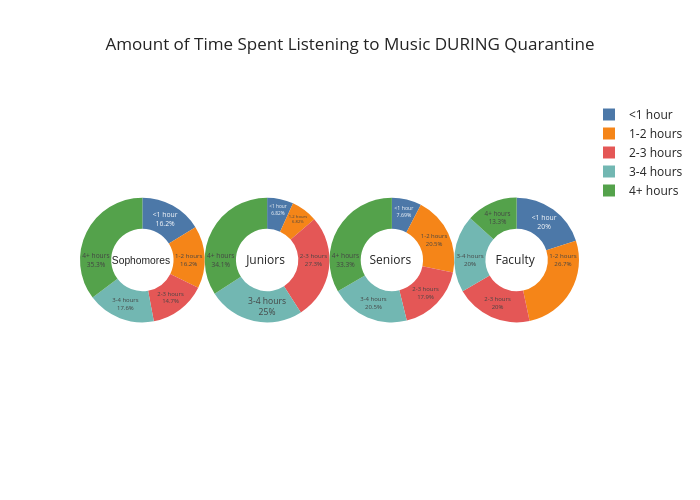
Ealcala's interactive graph and data of "Amount of Time Spent Listening to Music DURING Quarantine" is a pie, showing Sophomores , Juniors , Seniors , Faculty . The x-axis shows values from -1 to 6. The y-axis shows values from -1 to 4.