Edit chart
Loading graph
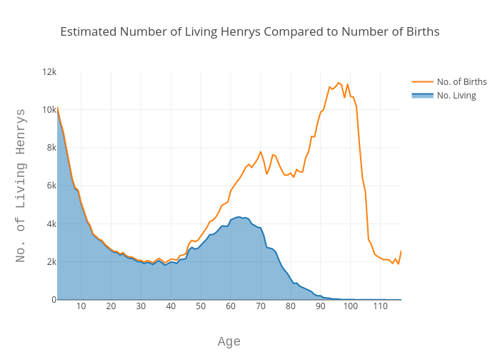
Echris's interactive graph and data of "Estimated Number of Living Henrys Compared to Number of Births" is a filled line chart, showing No. Living vs No. of Births; with Age in the x-axis and No. of Living Henrys in the y-axis.. The x-axis shows values from 0 to 0. The y-axis shows values from 0 to 0.