Edit chart
Loading graph
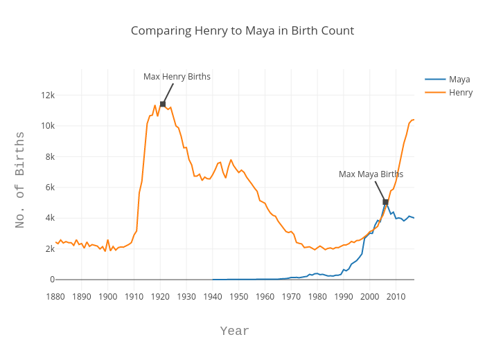
Echris's interactive graph and data of "Comparing Henry to Maya in Birth Count" is a line chart, showing Maya vs Henry; with Year in the x-axis and No. of Births in the y-axis.. The x-axis shows values from 0 to 0. The y-axis shows values from 0 to 0. This visualization has the following annotations: Max Henry Births; Max Maya Births