Edit chart
Loading graph
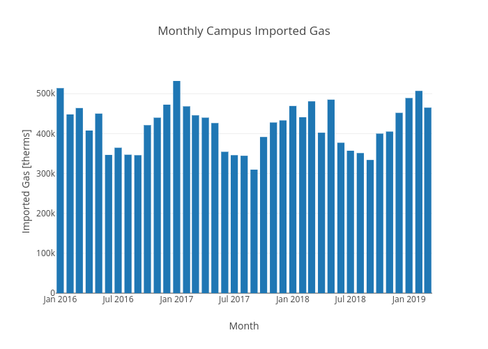
Energy_ucsc's interactive graph and data of "Monthly Campus Imported Gas" is a bar chart, showing GPGE01; with Month in the x-axis and Imported Gas [therms] in the y-axis.. The x-axis shows values from 0 to 0. The y-axis shows values from 0 to 0.