Edit chart
Loading graph
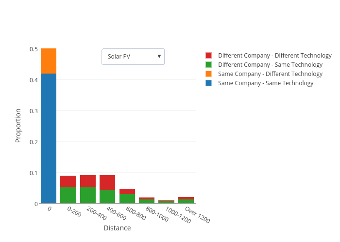
Fabio.matera's interactive graph and data of "Proportion vs Distance" is a stacked bar chart, showing Same Company - Same Technology, Same Company - Different Technology, Different Company - Same Technology, Different Company - Different Technology; with Distance in the x-axis and Proportion in the y-axis.. The x-axis shows values from 0 to 0. The y-axis shows values from 0 to 0.5.