Edit chart
Loading graph
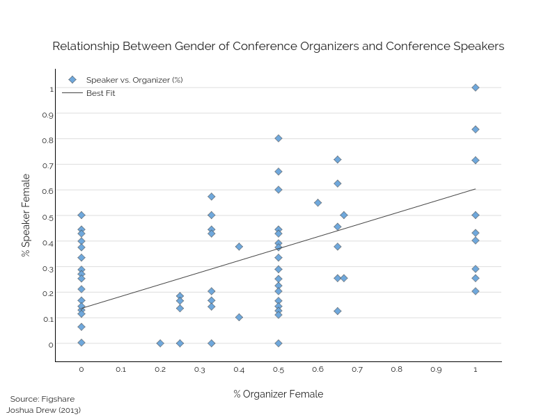
Figshare's interactive graph and data of "Relationship Between Gender of Conference Organizers and Conference Speakers" is a scatter chart, showing Speaker vs. Organizer (%) vs Best Fit; with % Organizer Female in the x-axis and % Speaker Female in the y-axis.. The x-axis shows values from -0.06537102473498232 to 1.0653710247349824. The y-axis shows values from -0.07065217391304347 to 1.0706521739130435. This visualization has the following annotation: Source: Figshare Joshua Drew (2013)