Edit chart
Loading graph
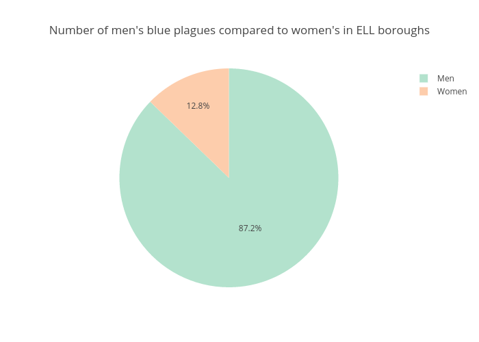
Gmuir001's interactive graph and data of "Number of men's blue plagues compared to women's in ELL boroughs" is a pie, showing Col2. The x-axis shows values from 0 to 0. The y-axis shows values from 0 to 0.