Edit chart
Loading graph
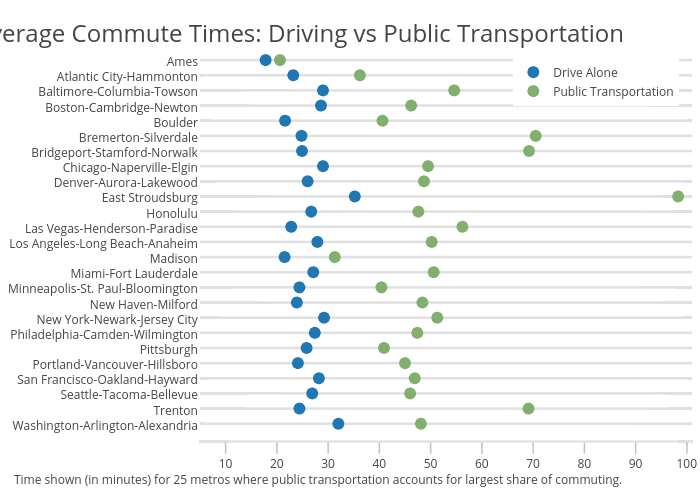
Governing's interactive graph and data of "Drive Alone vs Public Transportation" is a scatter chart, showing Drive Alone vs Public Transportation. The x-axis shows values from 5 to 101. The y-axis shows values from -1.1 to 25.78895571350465. This visualization has the following annotations: Time shown (in minutes) for 25 metros where public transportation accounts for largest share of commuting.; Average Commute Times: Driving vs Public Transportation