Edit chart
Loading graph
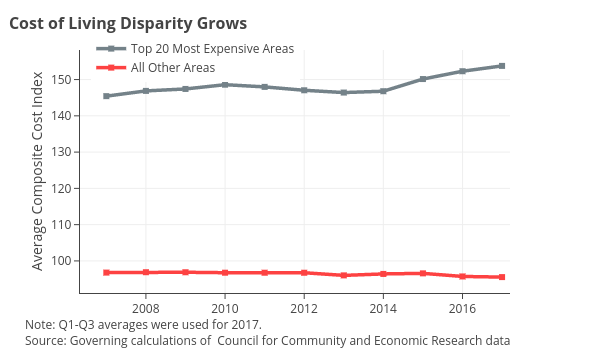
Governing's interactive graph and data of "Top 20 Most Expensive Areas vs All Other Areas" is a line chart, showing Top 20 Most Expensive Areas vs All Other Areas; with Average Composite Cost Index in the y-axis. The x-axis shows values from 2006.33465085639 to 2017.2. The y-axis shows values from 91.15658380681819 to 158.14841619318182. This visualization has the following annotations: Cost of Living Disparity Grows; Note: Q1-Q3 averages were used for 2017.Source: Governing calculations of Council for Community and Economic Research data