Edit chart
Loading graph
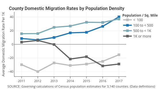
Governing's interactive graph and data of "< 100, 100 to < 500, 500 to < 1K, 1K or more" is a line chart, showing < 100, 100 to < 500, 500 to < 1K, 1K or more; with Average Domestic Migration Rate Per 1K in the y-axis. The x-axis shows values from 2010.555998229305 to 2017.444001770695. The y-axis shows values from -47.08529411764706 to 47.38529411764706. This visualization has the following annotations: County Domestic Migration Rates by Population Density; SOURCE: Governing calculations of Census population estimates for 3,140 counties. (Data definitions); Population / Sq. Mile