Edit chart
Loading graph
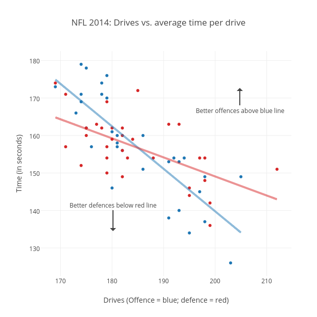
Grspur's interactive graph and data of "NFL 2014: Drives vs. average time per drive" is a scatter chart, showing Off. avg. time per drive, Def. avg. time per drive, Off. avg. time per drive - fit, Def. avg. time per drive - fit; with Drives (Offence = blue; defence = red) in the x-axis and Time (in seconds) in the y-axis.. The x-axis shows values from 166.19780853517878 to 214.80219146482122. The y-axis shows values from 122.48712998712999 to 182.51287001287002. This visualization has the following annotations: Better offences above blue line; Better defences below red line