Edit chart
Loading graph
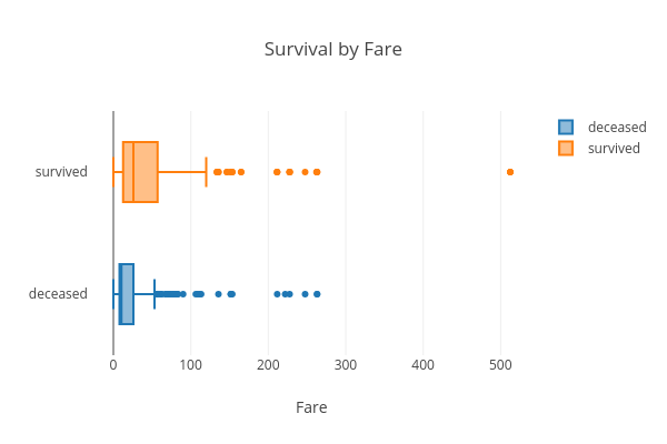
Hadaarjan's interactive graph and data of "Survival by Fare" is a box plot, showing deceased vs survived; with Fare in the x-axis. The x-axis shows values from 0 to 0. The y-axis shows values from 0 to 0.