Edit chart
Loading graph
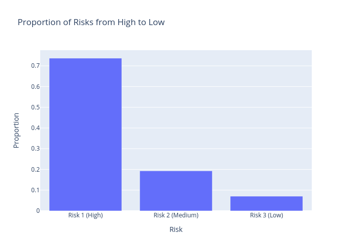
Hannaj's interactive graph and data of "Proportion of Risks from High to Low" is a bar chart; with Risk in the x-axis and Proportion in the y-axis.. The x-axis shows values from 0 to 0. The y-axis shows values from 0 to 0.