Edit chart
Loading graph
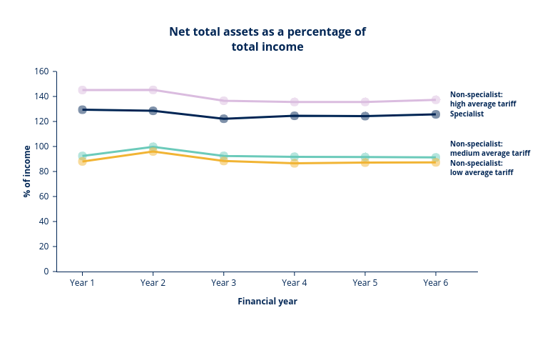
Hefceplots's interactive graph and data of "Net total assets as a percentage oftotal income" is a line chart, showing Specialist (all tariff), Non-specialist: high average tariff, Non-specialist: medium average tariff, Non-specialist: low average tariff; with Financial year in the x-axis and % of income in the y-axis.. The x-axis shows values from -0.3585271317829457 to 5.595599753579919. The y-axis shows values from 0 to 160. This visualization has the following annotations: Specialist; Non-specialist:high average tariff; Non-specialist:medium average tariff; Non-specialist: low average tariff