Edit chart
Loading graph
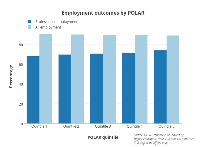
Hefceplots's interactive graph and data of "Employment outcomes by POLAR" is a grouped bar chart, showing Professional employment vs All employment; with POLAR quintile in the x-axis and Percentage in the y-axis.. The x-axis shows values from -0.5 to 4.5. The y-axis shows values from 0 to 95.15789473684211. This visualization has the following annotation: Source: HESA Destination of Leavers ofHigher Education. Note: Full-time UK-domiciledfirst degree qualifiers only