Edit chart
Loading graph
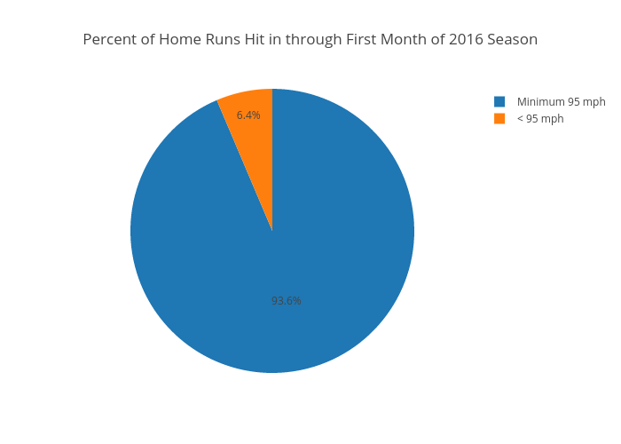
Jake_singleton's interactive graph and data of "Percent of Home Runs Hit in through First Month of 2016 Season" is a pie, showing B. The x-axis shows values from 0 to 0. The y-axis shows values from 0 to 0.