Edit chart
Loading graph
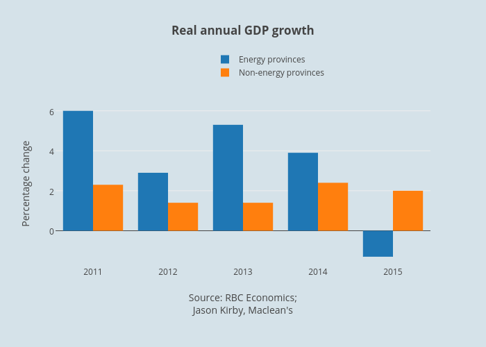
Jasonkirby's interactive graph and data of "Real annual GDP growth" is a bar chart, showing Energy provinces vs Non-energy provinces; with Source: RBC Economics;Jason Kirby, Maclean's in the x-axis and Percentage change in the y-axis.. The x-axis shows values from 2010.5 to 2015.5. The y-axis shows values from -1.7055555555555555 to 6.405555555555556.