Edit chart
Loading graph
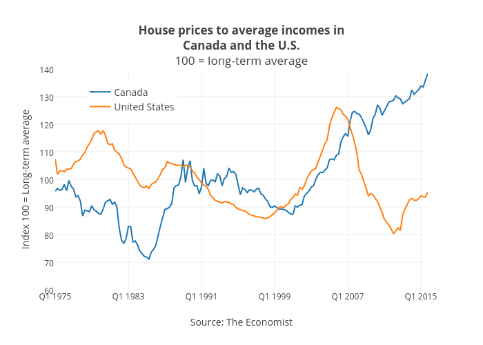
Jasonkirby's interactive graph and data of "House prices to average incomes inCanada and the U.S.100 = long-term average" is a scatter chart, showing Canada vs United States; with Source: The Economist in the x-axis and Index 100 = Long-term average in the y-axis.. The x-axis shows values from 0 to 163. The y-axis shows values from 60 to 140.