Edit chart
Loading graph
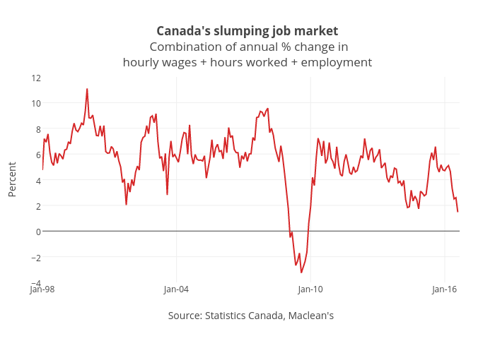
Jasonkirby's interactive graph and data of "Canada's slumping job market Combination of annual % change inhourly wages + hours worked + employment" is a line chart, showing B; with Source: Statistics Canada, Maclean's in the x-axis and Percent in the y-axis.. The x-axis shows values from 0 to 224. The y-axis shows values from -4 to 12.