Edit chart
Loading graph
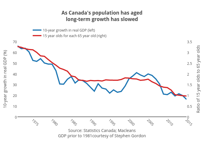
Jasonkirby's interactive graph and data of "As Canada's population has agedlong-term growth has slowed" is a line chart, showing 10-year growth in real GDP (left) vs 15 year olds for each 65 year old (right); with Source: Statistics Canada; MacleansGDP prior to 1981courtesy of Stephen Gordon in the x-axis and 10-year growth in real GDP (%) in the y-axis.. The x-axis shows values from 1971 to 2015. The y-axis shows values from 0 to 70.