Edit chart
Loading graph
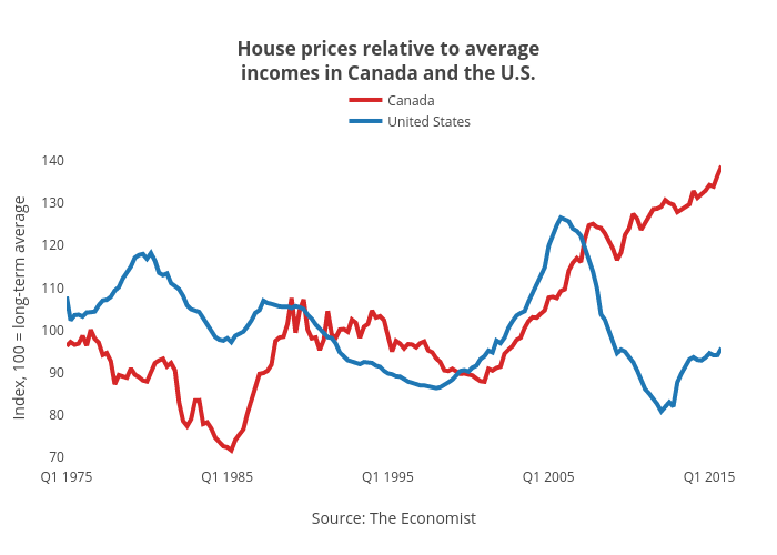
Jasonkirby's interactive graph and data of "House prices relative to averageincomes in Canada and the U.S." is a line chart, showing Canada vs United States; with Source: The Economist in the x-axis and Index, 100 = long-term average in the y-axis.. The x-axis shows values from 0 to 163. The y-axis shows values from 67.36156685444445 to 142.08961216555556.