Edit chart
Loading graph
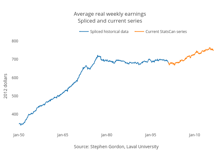
Jasonkirby's interactive graph and data of "Average real weekly earningsSpliced and current series" is a line chart, showing Spliced historical data vs Current StatsCan series; with Source: Stephen Gordon, Laval University in the x-axis and 2012 dollars in the y-axis.. The x-axis shows values from 0 to 798. The y-axis shows values from 301 to 800.