Edit chart
Loading graph
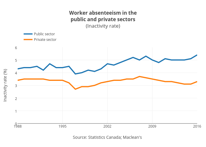
Jasonkirby's interactive graph and data of "Worker absenteeism in thepublic and private sectors(Inactivity rate)" is a line chart, showing Public sector vs Private sector; with Source: Statistics Canada; Maclean's in the x-axis and Inactivity rate (%) in the y-axis.. The x-axis shows values from 1988 to 2016. The y-axis shows values from 0 to 6.