Edit chart
Loading graph
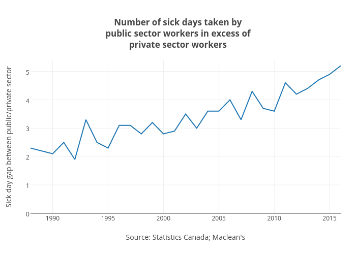
Jasonkirby's interactive graph and data of "Number of sick days taken bypublic sector workers in excess ofprivate sector workers" is a line chart, showing B; with Source: Statistics Canada; Maclean's in the x-axis and Sick day gap between public/private sector in the y-axis.. The x-axis shows values from 1988 to 2016. The y-axis shows values from 0 to 5.383333333333334.