Edit chart
Loading graph
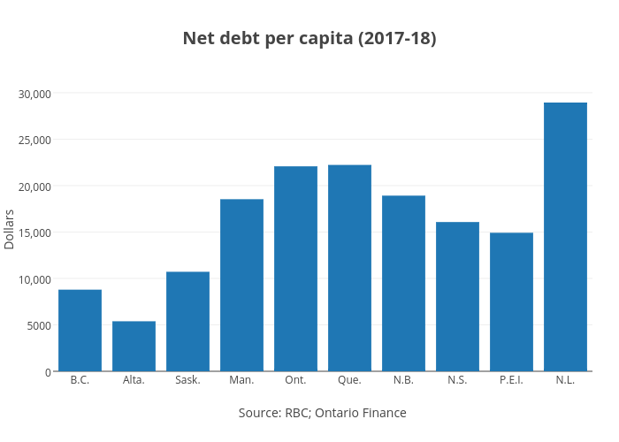
Jasonkirby's interactive graph and data of "Net debt per capita (2017-18)" is a bar chart, showing B; with Source: RBC; Ontario Finance in the x-axis and Dollars in the y-axis.. The x-axis shows values from -0.5 to 9.5. The y-axis shows values from 0 to 30468.42105263158.