Edit chart
Loading graph
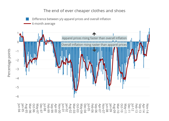
Jasonkirby's interactive graph and data of "The end of ever cheaper clothes and shoes" is a bar chart, showing Difference between y/y apparel prices and overall inflation vs 6-month average; with Percentage points in the y-axis. The x-axis shows values from -0.5 to 248.5. The y-axis shows values from -6.627777777777778 to 1.9277777777777778. This visualization has the following annotations: Apparel prices rising faster than overall inflation; Overall inflation rising raster than apparel prices