Edit chart
Loading graph
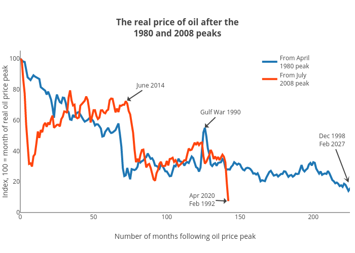
Jasonkirby's interactive graph and data of "The real price of oil after the1980 and 2008 peaks" is a line chart, showing From April1980 peak vs From July2008 peak; with Number of months following oil price peak in the x-axis and Index, 100 = month of real oil price peak in the y-axis.. The x-axis shows values from 0 to 225. The y-axis shows values from 0 to 105.26315789473684. This visualization has the following annotations: Dec 1998Feb 2027; June 2014; Gulf War 1990; Apr 2020Feb 1992