Edit chart
Loading graph
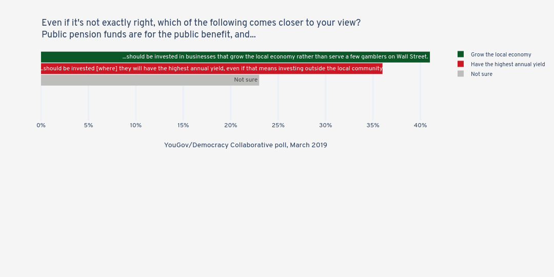
Jduda's interactive graph and data of "Even if it's not exactly right, which of the following comes closer to your view?Public pension funds are for the public benefit, and..." is a grouped bar chart, showing Not sure, Have the highest annual yield, Grow the local economy; with YouGov/Democracy Collaborative poll, March 2019 in the x-axis. The x-axis shows values from 0 to 43.1578947368421. The y-axis shows values from -0.5 to 1.5.